In the previous post, I gave a hugely simplified explanation of the Word2Vec algorithm to help people who aren’t familiar with neural networks understand why word vectors are important and how they are generated. I would highly recommend reading that post before this one. The goal was to explain the process from the ground up, but that actually becomes a difficult constraint to meet in one reasonably sized blog post. This post will explain everything I chose to leave out of the last post, especially with respect to how Word2Vec is implemented in practice. While it has been shown to preserve relationships between words, the inspiration of this post is the idea that the intentional distribution of colors in paintings might also have an underlying semantic structure, and the last two posts combined are intended to give all the background knowledge required for understanding and investigating the possibility of color vectors.
Activation Functions In The Wild
The activation functions for different sets of neurons in a neural network are arguably the most important architectural characteristics of that network, and poor choices for activation functions can completely block a network from learning. There are many options, but one of the most common is called the sigmoid function. It’s very simple:
Technically, a sigmoid function is any function that is bounded, differentiable for all real values, and which has a non-negative derivative at each point. “The sigmoid function” generally refers to the special case above, and it is a very common choice for a neural activation function because it has a “nice” derivative, meaning that it can be calculated quickly. Note that the bounds for the sigmoid function are , allowing it to convert its inputs to the correct range for a continuous probability density function. In many cases, using these functions to “reformat” parts of the network as a density function of the input provides a helpful framework for analyzing the performance and training of the network. In this view, stochastic gradient descent on the network parameters is just Maximum Likelihood Estmiation: we are approximating some ideal infinitely complicated statistical distribution for which events are data itself by finding the parameters of a finite model that make it most likely for our sample (the training dataset) to occur.
For output layers, a common alternative to sigmoid functions is softmax. Softmax is usually used as the activation function of the last layer because it guarantees that the sum of the activations of the neurons in the last layer is equal to one, allowing the network’s output components to form a discrete probability density function. It is defined in terms of the neuron outputs as follows:
This has the attractive property of attributing lots of density to comparitively large values because becomes much greater than any of the other terms. If many values have the same magnitude, our probability densities get split between them fairly evenly. Softmax also satisfies the differentiability requirement for neural network activation functions, and has a suitably “nice” derivative.
A network’s loss function is also a hugely important architectural decision, and again, there are many choices available. In the last post, we used the example function , which is just the difference between our ideal and actual output. This type of loss is called L1 Loss, and it is closely related to L2 Loss: . Neither of these two loss functions see much use on their own, but they are occasionally incorporated as extra terms in more common loss functions to affect the weight distribution in different layers of the network (see regularization).
Instead, loss functions like cross entropy are more common. Cross entropy can be considered as a “distance measurement” between probability distributions, in the same sense that cosine similarity serves as a distance measurement between vectors. To understand why, we have to discuss entropy – oh no! Entropy is defined by Wikipedia as the “average amount of information produced by a stochastic source of data.” A stochastic data source just produces random events, and the “amount of information” from that source is measured as the minimum number of bits required to describe what the random source is doing. To find the entropy of a probability distribution is to ask, “if I use the absolute most efficient encoding scheme to transmit events from this distribution over time, how much information on average would I need to transmit?” Entropy is deeply connected to physics, were it can be helpful to understand how “complex” a system is. To find the entropy of a system is to ask, “if I use the absolute most compact representation to transmit the state of the system over time, how much information on average would I need to transmit?” If, for example, it is highly likely for a particle in the system to be moving to the right with a specific acceleration, that system has a lower entropy than one where particles move randomly because only one state has to be considered for all of the particles with identical movement. Similarly, if a specific event in a distribution is more likely than any other, that distribution has a lower entropy because the ideal encoding can assign fewer bits to the frequent event, reducing the information transferred.
In this case, the cross entropy allows you to compare two distributions by finding the average amount of information required to convey events from one distribution if, instead of the optimal encoding scheme, you used the optimal scheme from a different distribution. If those distributions are similar, the entropy is close to its minimum, but if they’re different, the encoding scheme becomes inefficient and costly. Cross entropy is defined below in terms of two distributions, and , and for a detailed derivation I highly recommend this explanation.
Optimizations on Softmax
Softmax is great, and it gets a lot of use, especially in neural networks that classify input examples into one of a few different classes. It would make sense to use when generating word vectors because the goal (for skip-gram) is to take a word’s context as input and assign accurate probabilities for each of the words in the vocabulary that that word is missing from the context. It is classifying context inputs into the words they’re missing. Unfortunately, there is one problem with using softmax as it is described above. Word2Vec must train on a large set of text, which necessarily has a large vocabulary size. For example, the vocabulary size of all the computer science papers in ArXiv is greater than 150,000 words, and the Oxford English Dictionary has definitions for more than 200,000 words. To compute softmax for a single class, we have to do approximately that many exponentiations, which is extremely inefficient. To solve this problem, Word2Vec provides two main options for more efficient output probability distributions: hierarchical softmax and negative sampling. The following discussion will be given in terms of the skip-gram model architecture (where the network uses a word to predict its context) because while one is a “reversed” version of the other, they end up with extremeley similar implementations so that discussing them separately is redundant.
Hierarchical Softmax
Hierarchical softmax is all about coming up with a hierarchy. Specifically, to perform hierarchical softmax, the entire output layer is replaced with a Huffman Tree. Instead of a simple layer of neurons, we now have a tree of neurons, where those neurons whose output doesn’t connect as input to other neurons is a leaf (a node without children). The Huffman Tree was originally proposed as an encoding scheme for a group of symbols that would assign each of them an ID based on their position in the tree. Each number in a symbol’s ID would correspond to either a left or a right child node, and the whole ID would indicate a specific leaf corresponding to a specific symbol. More frequent symbols would get earlier child nodes and thus shorter ID codes. Huffman proposed a method for generating these trees that is efficient (specifically, execution time scales linearly with input size), so that we can easily use them with large vocabularies. As an example, see the figure below, where larger letters correspond to leaves for more frequent symbols.

The idea of a tree of neurons is new, and it’s definitely an uncommon architecture for a neural network. Under this new organization, every junction is a neuron with sigmoid activation whose input is the second layer (the “hidden” layer) output. To be clear, even though these neurons are thought of as composing a tree, they do not connect to each other: they get the hidden layer in and give a probability out. Each leaf node is designated to correspond to a specific word, with more frequent words going to earlier leaf nodes. We use this tree to get probabilities for those words by imagining a random walk, where at each junction the probability for choosing the left child is that junction’s neuron activation. Remember that the activation of the sigmoid function is between and , and each leaf’s final probability is the joint probability of all the decisions required to end at that leaf.
To recap, we have a predetermined tree organization where each junction has a neuron that receives its own copy of the hidden layer output. Using the sigmoid function, each neuron’s weights allow it to come up with an independent probability value for the left child over the right child. Then, the final probability for a specific word is the product of all the junction probabilities on the way to that word. The use of the Huffman Tree makes it more efficient to calculate probabilities for more frequent words by reducing the number of products required. The goal for the neurons in the new output layer is to learn weights for the hidden layer output so that only the path leading to the correct word has a high probability. For a concrete example, see the figure below:

Since the overall probability of reaching a leaf node is , this new output structure takes the place of softmax in converting our network into a probability density function. Instead of calculating an extreme number of exponentials for each output class, we only have to calculate the product of the junction nodes on the way to a specific leaf, solving the efficiency problem.
Negative Sampling
Luckily, the alternative to hierarchical softmax is much simpler. “Negative sampling” is a simplification of “Noise Contrastive Estimation,” which sidesteps softmax by changing the entire goal of the network. Instead of learning the probability of context words given the input word, negative sampling incorporates a separate fake distribution that spits out random words according to predefined probabilities. The network’s new goal becomes taking an observed input and differentiating between a sample from the noise distribution and an actual word in the context of the observed word. For a specific word , those words which are not in its context are the negative samples. During training, for each word we sample words from and the network’s goal is to maximize the joint probability of correctly identifying the positive and negative samples. This is where negative sampling becomes more efficient: instead of doing computations for all words in the vocabulary, we can isolate words we care about. The noise distribution should be picked to deprioritize frequent words to account for the increased likelihood they will become samples, but the overall effect is to reduce the number of redundant computations by introducing a convenient parameter that gives easy control over about how many times a word will be considered as a negative sample. As with the Huffman Tree, we’re going to explore the specific mechanics of this technique, but I also want to explain and drive the mathematical formula behind negative sampling.
First, we have the probability density function our network is learning, . This gives the probability of a context word given an observed word. That’s part of our goal, but the other part is identifying negative samples: . Since we want to take $k$ samples that are all false, we must calculate the joint probability of their falsehood:
This works for a specific sample, but for our ideal training goal we want to maximize the expected value (read: the average) of the probability that none of the noise words in a sample are accidentally identified as context words:
This equation is saying “if has the distribution , what is the mean likelihood that five different values of are all false.” There are two other tricks the authors use. First, they convert all probabilities to log probabilities, which are a nice way to store floats of extremely small magnitude as negative floats with less extreme magnitudes. Additionally, a joint log probability is a sum, where a joint probability is a product, and sums can be calculated more quickly. This gives us:
The other trick is that the expected value of a sum is equal to the sum of expected values, so we can move the expected value operator into that sum. With our final expresssion for calculating the negative sample log probability, we can add the (log) probability of our positive sample:
This is the formula given in the Word2Vec paper, albeit in terms of the effective probability distribution we get from the network where the paper’s formula is given in terms of the output layer parameters. I’m leaving those out because they’re not required to understand the mechanics of negative sampling loss. Remember that adding the log probability $\log(c|w_i)$ is also multiplying the probability by our average probability of negative samples, so overall we’re maximizing the probability that our network predicts an observed context word but not any unobserved context words. This brings us back to our original intuition, “taking an observed input and differentiating between a sample from the noise distribution and an actual word in the context of the observed word.”
Applications: Color Vectors
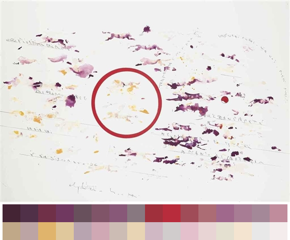
I wrote these posts because I wanted to explore the possibility of semantic relationships between colors using this vector embedding scheme. To do so, I used the Painter By Numbers dataset from Kaggle. The first step was to find ways to isolate colors from each painting and adapt them to the Word2Vec architecture. I considered taking each pixel’s context to be those pixels immediately surrounding it, but this would saturate the training data with examples indicating that colors in the same context are of equal or extremely similar shades. Instead, I decided to use a color quantization algorithm called Median Cut Quantization (MCQ). “Quantization” is a noun form of the action “to quantize,” meaning to restrict the number of possible values of a quantity. We are restricting the colors in the image to a predefined number to focus on the set of colors that are most well represented in the image.
MCQ allows you to compute “representative colors” where is an integer, and it finds them by repeatedly sorting the image’s pixels and splitting them at the median. Each of the resulting pixel groups get sorted and split again, until we have as many groups as desired outputs. Then, each group is collapsed into the “mean color” by averaging all of the group’s members. Since pixels actually have three components, the sorting process orders them by whichever dimension has the most variance.
1
2
3
4
5
6
7
8
9
10
11
12
13
14
15
16
17
18
19
20
21
22
23
24
25
26
27
28
29
30
31
32
def median_cut(bucket, categories):
    # Categories gives our target categories to make from a pixel bucket
    # If it is 1, we can average that bucket
    if categories == 1:
        sum_r = sum([x[0] for x in bucket])
        sum_g = sum([x[1] for x in bucket])
        sum_b = sum([x[2] for x in bucket])
        # Use double divide to avoid floating point colors
        return np.array((sum_r // len(bucket),
                         sum_g // len(bucket),
                         sum_b // len(bucket)), ndmin=2)

    # If not 1, we need to sort on the axis with the biggest range
    maxes = [-1, -1, -1]
    mins = [256, 256, 256]
    # Calculate the range
    for i in range(3):
        for pixel in bucket:
            if pixel[i] > maxes[i]:
                maxes[i] = pixel[i]
            if pixel[i] < mins[i]:
                mins[i] = pixel[i]
    ranges = [maxes[i] - mins[i] for i in range(3)]
    largest_range = ranges.index(max(ranges))
    # Sort
    bucket = bucket[bucket[:,largest_range].argsort()]

    # Split our sorted bucket into two new buckets and halve categories
    return np.append(median_cut(bucket[:len(bucket) // 2]
                                categories / 2),
                     median_cut(bucket[len(bucket) // 2:],
                                categories / 2), axis = 0)
Performing these repeated sort operations on even moderately sized images takes a very long time, so the images in the dataset were scaled down before this process to reduce the number of pixels being considered. 32 colors were drawn from each image, and these were each considered to form a mutual context example. So, to implement the skip-gram model, our goal for one of these colors is to maximize the output probabilities of the other 31. In an initial iteration of this project, the most common colors were almost always blacks and greys, and it was difficult to identify brighter colors to examine the relationships between them. To address the problem, I regenerated MCQ but removed repeated pixels from image image, under the intuition that the overrepresentation of blacks and greys was a result of more frequent use of darker background colors in paintings to draw attention to the brighter accent colors. Eliminating repeated pixels somewhat reduced the saturation of darker colors, but did not completely address the problem. An example image with its representative colors is below.
The skip-gram implementation I used to generate these vectors is basically a vanilla Tensorflow implementation, and the explanations provided above are more important than the mechanics behind their implementation. Using that code, I generated vector embeddings for the MCQ representative colors. There are many ways to visualize the results, but one common method is t-distributed Stochastic Neighor Embedding (t-SNE). This is an algorithm for “dimensionality reduction,” where high dimensional data (we’ll call this data “complicated”) like word vectors are collapsed into fewer dimensions (making them “simplified”). If we collapse the vectors into two or three dimensions, they can be visualized on a plot, and t-SNE is designed to prioritize close relationships between complicated inputs in the simplified outputs. So, if a group of points are clustered in the simplified representation, their complicated counterparts are also near each other, while large distances between clusters do not accurately reflect large distances in the complicated space. The t-SNE plot of the 5000 most common vectors is below:
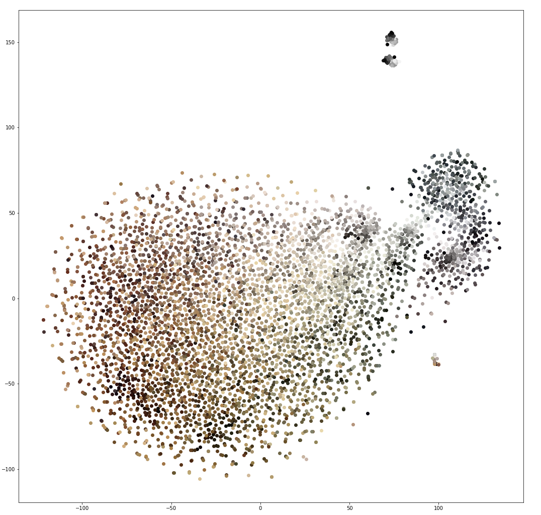
Obviously, the saturation of dark colors is still not fully addressed, which makes it more difficlut to assess the relationship between the full color spectrum. Still, this image shows a large cluster of shades of brown with a slightly separated group of colors which are more strictly greyscale. The image has three very small separated clusters, but again large distances don’t carry much meaning, and their separation is likely just an artifact of limited data.
To visualize the relationship between brighter colors, I had to cherry pick a group of less frequent colors to generate this image. Here is the t-SNE plot of the 15000th to 20000th most frequent colors:
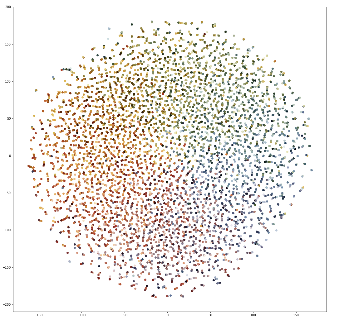
This closely resembles a color wheel, and implies that some level of color understanding has been learned. However, upon further investigation, the most similar vectors for all of these colors are generally seemingly random colors with a cosine similarity of about , which is not that similar. This implies that while the network might have some clue that that reds should be generally closer to other reds (and etc), we haven’t learned good vectors for these colors. For comparison, the darker colors featured in the image above have nearest neighbors of generally similar shades of the same color, with similarity measurements of around . Again, dark colors occur frequently enough for good representations to be learned, while brighter and more vibrant colors do not. I am going to continue investigating ways to sample colors from the images dataset, and this post may be updated in the future.
My best guess at the cause of the problem is that even when performing MCQ on the unique pixels, the more frequent use of dark colors increases the number of unique dark colors, allowing for more training data about them. Especially in digitized paintings, large regions of the same color may have many extremely similar shades of the same color. I attempted to address this problem by reducing the bit depth of the images during preprocessing (from 8 bit colors to 6 bit colors), as well as changing the number of colors selected from each image, but I did not observe significant improvements in the vector representations. This conclusion is further supported by the network’s ability to converge to low loss in all cases. The average loss per 1000 training iterations generally settled to around $5.0$, which is consistent with example Word2Vec implementations. Colors of similar shades may occur in many images, but colors of precisely the same shade seem to be occurring in too few images to generate good representations, forcing the network to memorize their contexts.
Even if this example could use further development, I think it’s a great illustration of ways to apply and visualize Word2Vec. There are many applications for embeddings outside of generating pretty graphs, and I hope this post gives some insight into the concepts behind their generation as well as the reasons why they do (or don’t) work so well.